TurnKey Infotech

TurnKey Infotech

Service Details

Responsive Website Design

Thumb

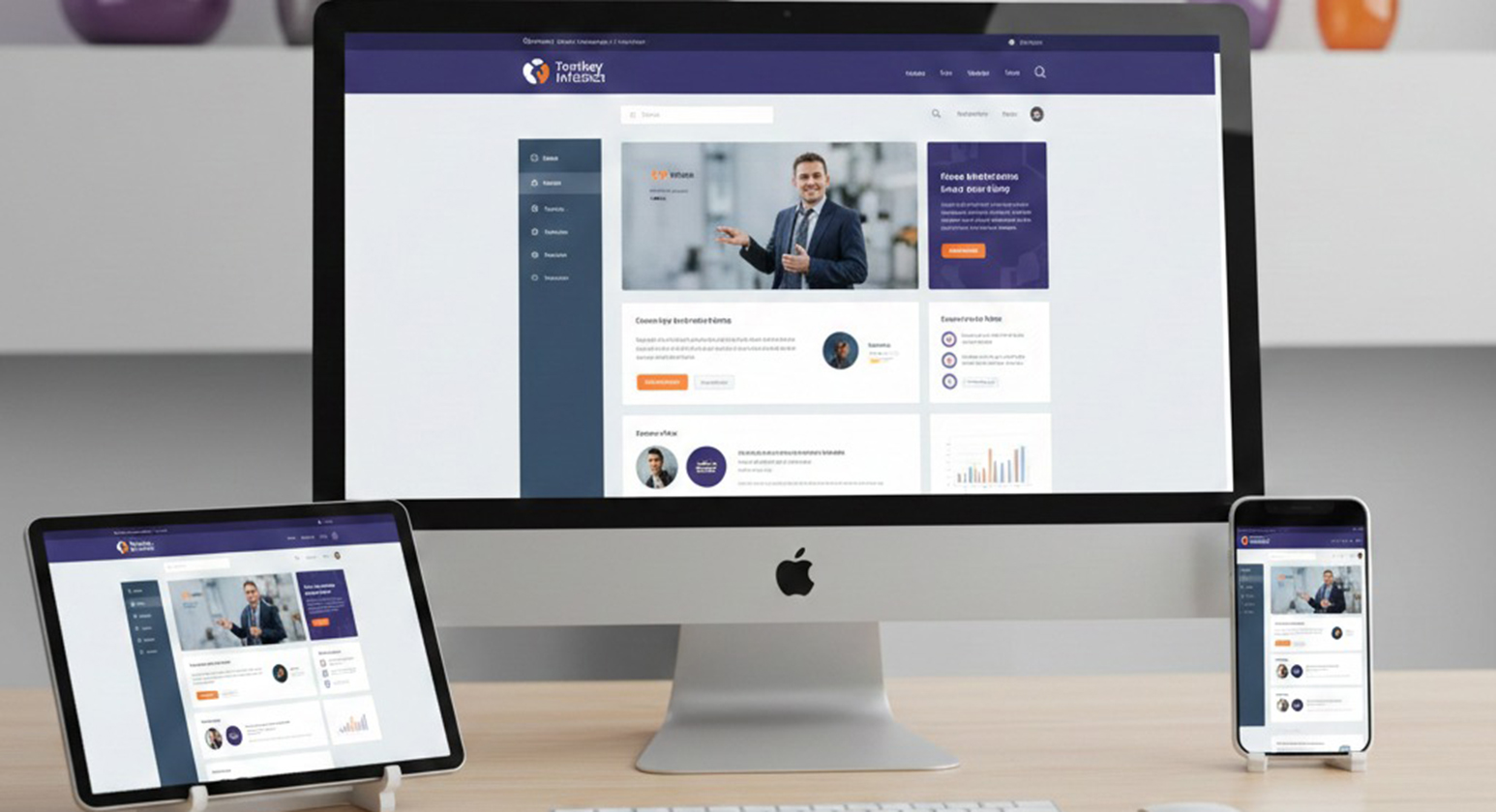
Responsive website design ensures your website works flawlessly across desktops, tablets, and mobile devices. Users expect fast, clear, and easy navigation regardless of screen size. A responsive website automatically adjusts layout, images, and content to fit every device, improving usability and engagement. Google prioritizes mobile-friendly websites in search rankings, making responsiveness essential for visibility. Responsive design reduces bounce rates, increases time on site, and improves conversion rates. It also eliminates the need for separate mobile websites, lowering maintenance costs. For businesses, responsive websites deliver consistent branding, better user experience, and stronger performance across all devices.

Key Benefits of Responsive Design

1

Mobile-Friendly Experience

Your website adapts to all screen sizes, ensuring smooth navigation, and better interaction for mobile users.

2

Improved Search Rankings

Search engines favor responsive websites, helping your business rank higher in mobile and local search results.

3

Higher Conversion Rates

Better usability and faster loading improve user trust, leading to more inquiries, sign-ups, and sales.


Image Not Found

Performance and Impact

A responsive website enhances user engagement, retention, and overall business performance. By adapting seamlessly to desktops, tablets, and mobile devices, it encourages users to explore, interact, and convert. Improved usability boosts lead generation, strengthens brand credibility, and supports SEO. Investing in a responsive site provides a scalable digital platform that drives measurable growth in engagement, conversions, and revenue.

  • Image Not Found
    60% Mobile Traffic
  • 30%

    Higher Conversions

Why Choose Turnkey Infotech

At Turnkey Infotech, we create responsive websites that prioritize performance, clarity, and conversions. Our designs are visually appealing, fast-loading, and fully optimized for all devices, ensuring a seamless user experience whether viewed on a desktop, tablet, or smartphone. By integrating SEO-ready structures, intuitive navigation, and strategically placed calls-to-action, we help businesses engage users effectively, generate more leads, and drive sustainable growth. With our responsive design approach, your website doesn’t just look good—it performs exceptionally across every platform, supporting your digital success every step of the way.

Responsive website design is the practice of creating websites that automatically adjust their layout, images, and content to fit any screen size, from desktops to smartphones. This ensures that users have a seamless and consistent experience, regardless of the device they use.

  • Adapts to all screen sizes
  • Enhances user experience
  • Reduces bounce rates
  • Increases engagement and conversions

Yes, responsive design significantly boosts SEO. Google and other search engines favor mobile-friendly websites, which improves your website’s visibility and search rankings. A responsive design also ensures faster loading times and better usability, both of which contribute to higher organic traffic and improved search performance.

  • Mobile-friendly websites rank higher in search results
  • Improved visibility and traffic
  • Faster page loading enhances SEO
  • Better user experience reduces bounce rates

Absolutely. Responsive websites are essential for businesses of all sizes—from startups to large enterprises. They allow businesses to reach their audience effectively on any device, ensuring that customers have a consistent and engaging experience no matter how they access your site.

  • Ideal for startups and established companies
  • Ensures accessibility across devices
  • Enhances brand credibility and user trust
  • Supports growth and online engagement